

Author: Alexander Kleijngeld
Welcome back to our PACT series: a collection of blog posts dedicated to the key principles and best practices of successful packaging design. In part 4, we’re talking about logos, the role they play in packaging design, and how to best integrate them in your packaging design. Let’s dive in.
Your logo is a distinctive brand asset
For a lot of brands, their logo is their most distinctive brand asset. Your logo is the apex of your brand identity and can not only trigger instant brand recognition but also unlock rich (sub)conscious associations and, in some cases, a sense of desirability. In the context of packaged goods, think about the iconic logos of Chanel, Starbucks, Nike’s bold swoosh, or the smiling Pepsi logo. Each of these logos is instantly recognized by most and plays an integral role in its brand’s identity.
When integrated into your packaging design, your logo has the potential to:
- Drive speed of recognition
- Increase shelf visibility
- Facilitate shelf findability
- Drive desirability and (premium) price perceptions
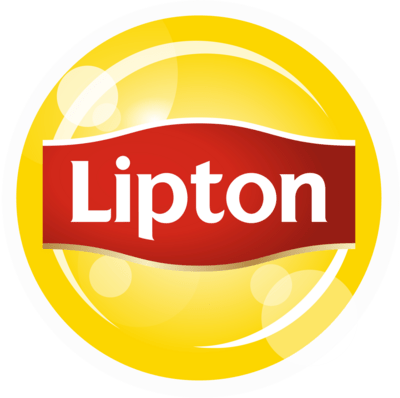
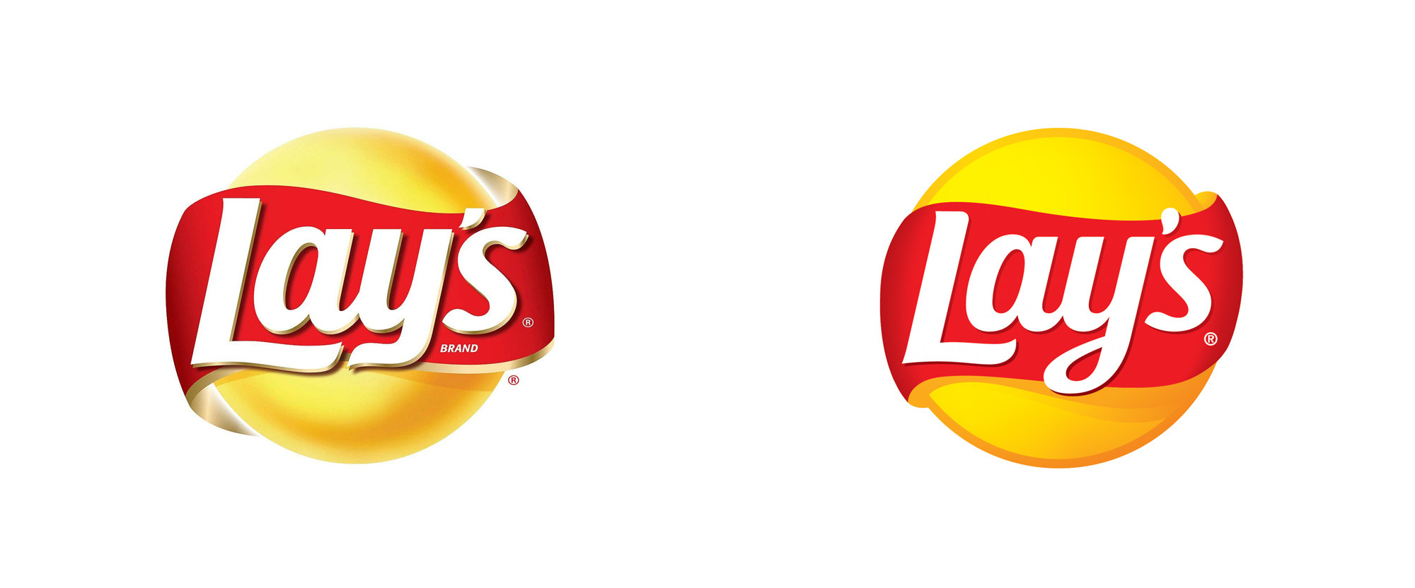
Our packaging design testing practice’s benchmark database reveals which on-pack logos contribute most to the ease and speed of brand recognition within a split-second (0.1 seconds). Here are a few examples:
Notice the similarities? From a creative perspective, we can conclude that each of these logos features:
- A round(ish) shape,
- Contrasting colors (red, green, yellow, blue)
- Short, recognizable brand names
Where and how to place your logo on your pack
As important as your logo’s design is its placement on your packaging design. Pack designs with strong brand recognition tend to have their logo:
- Printed in mid-sized format (taking 20% to 35% of vertical space)
- Uncluttered, so no other design elements are close to the logo
- Placed near the top of the pack (around 10% to 25% from the top). This helps ease the hierarchy (the order in which design elements are seen). Our meta-learnings reveal that designs that draw attention to the brand logo first (before any other design elements are seen) are more easily understood, which can lead to higher sales.
What is interesting is that even minor creative choices can have a significant impact on brand recognition. Brands with lower recognition often feature small-sized logos placed in an unfavorable position on the packaging (e.g. on the side or near the bottom), with little to no color contrasts, and an overall cluttered design.
When zooming out, the size or placement of your logo may seem insignificant to your packaging design’s effectiveness. But the truth is that logo placement can make or break your packaging design. When we compared 3 competing packaging designs of toilet bowl cleaning products, we found a significant difference in the speed of brand recognition scores:
In summary, the creative characteristics of your logo, as well as how and where it is integrated in your packaging design, can significantly influence the performance of your design – in particular its recognition, visibility, and ease of finding. It isn’t always easy to get right, but that’s where we can help. Reach out to us today to learn about how our PACT solution suite can elevate your packaging design.
